The SGPlot Procedure
COVID-19 data per country and over time
Added 3 June: animated map
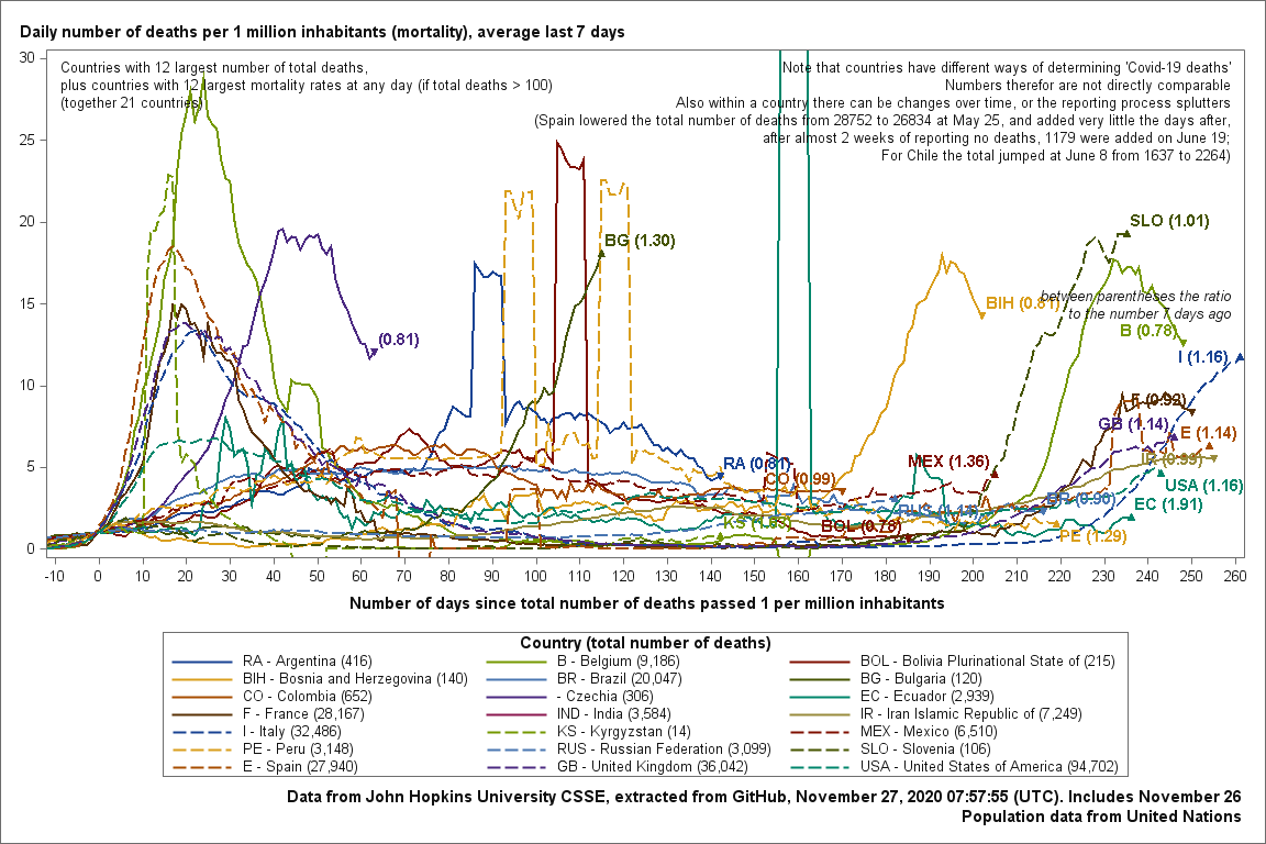
Below I present some graphs using the Covid-19 data on deaths per country compiled by the John Hopkins University.
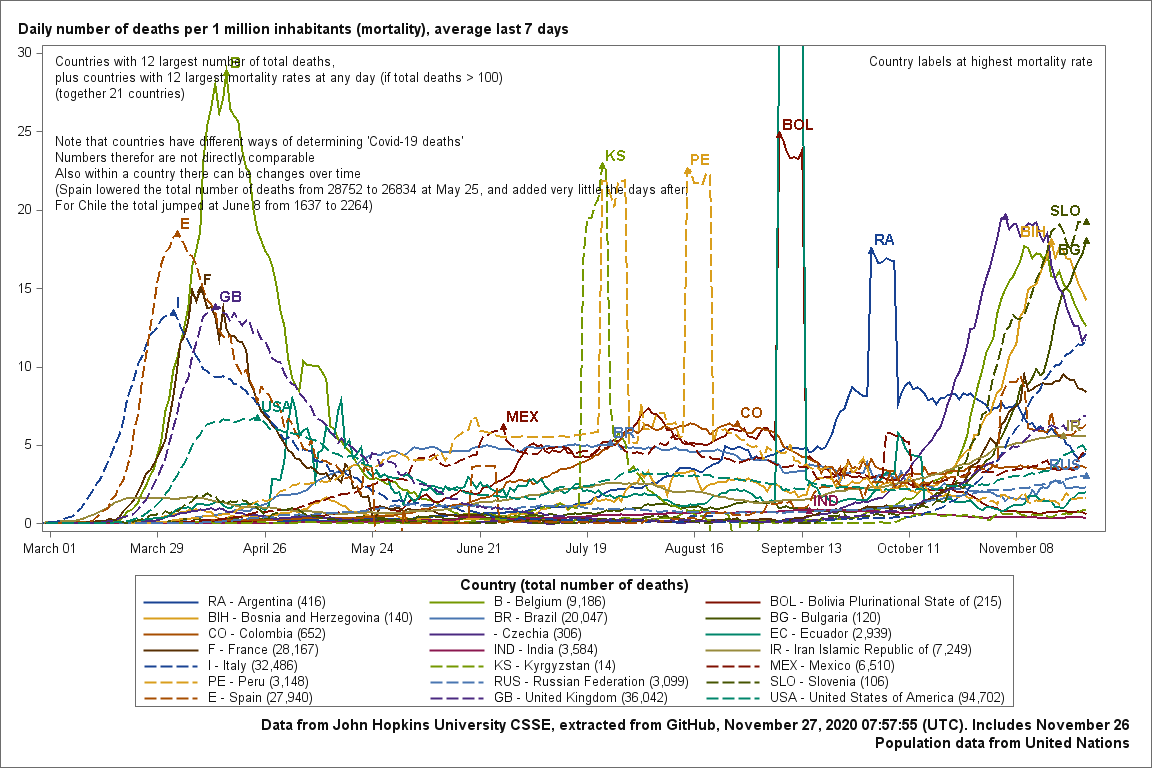
The first two show mortality rates (the daily number of death per million inhabitants) over time. I think this is the best way to compare countries, although one must take into account that countries differ in the way they determine Covid-19 related deaths.
In the first graph the time axis is the number of days since the epidemic started in that country.
The second graph uses actual calendar dates.
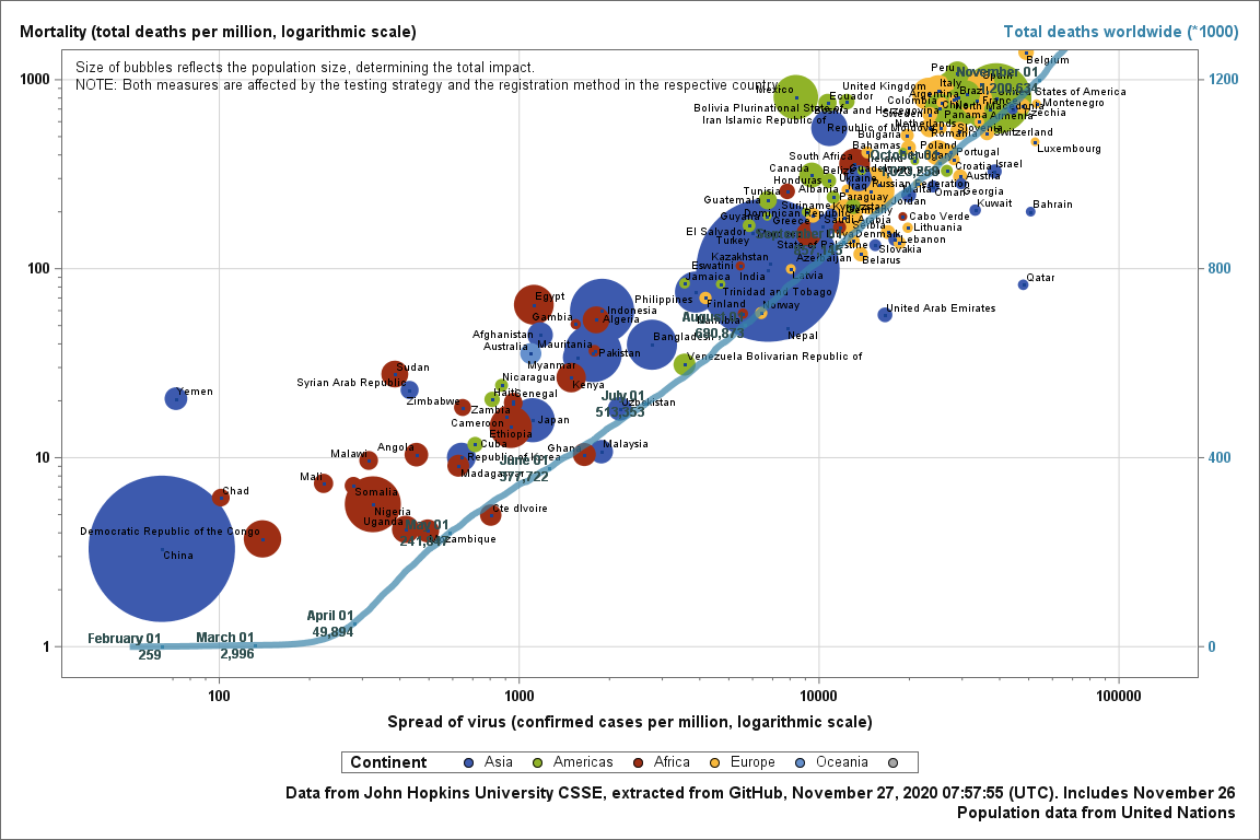
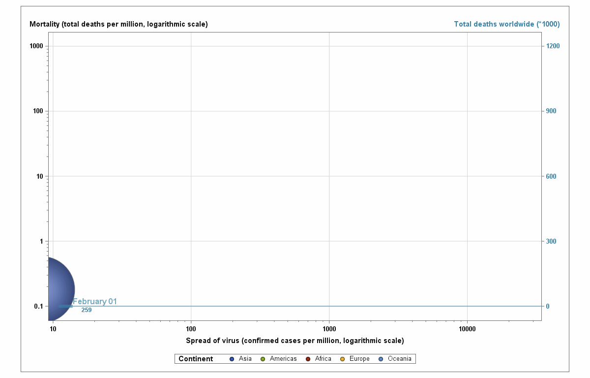
The third and fourth graphs are bubble plots trying to relate several indicators:
⁕ Population size
⁕ Mortality (number of Covid-19 related deaths per capita)
⁕ Spread of disease (confirmed infections par capita).
The numbers are affected by the registration levels, which differ between countries.
The first bubble plot is a static one showing the current situation. The other is animated, showing the same data over time.
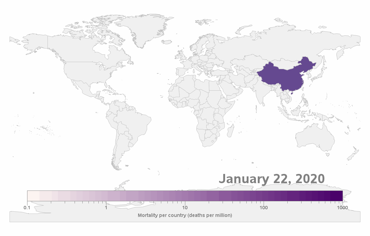
The last graph is an animated map showing how the virus spread around the world
Data extracted November 27, 2020 07:57:55 (UTC).